Serifs on screen used to be a compromise. High-density displays changed the maths, but not the rules.
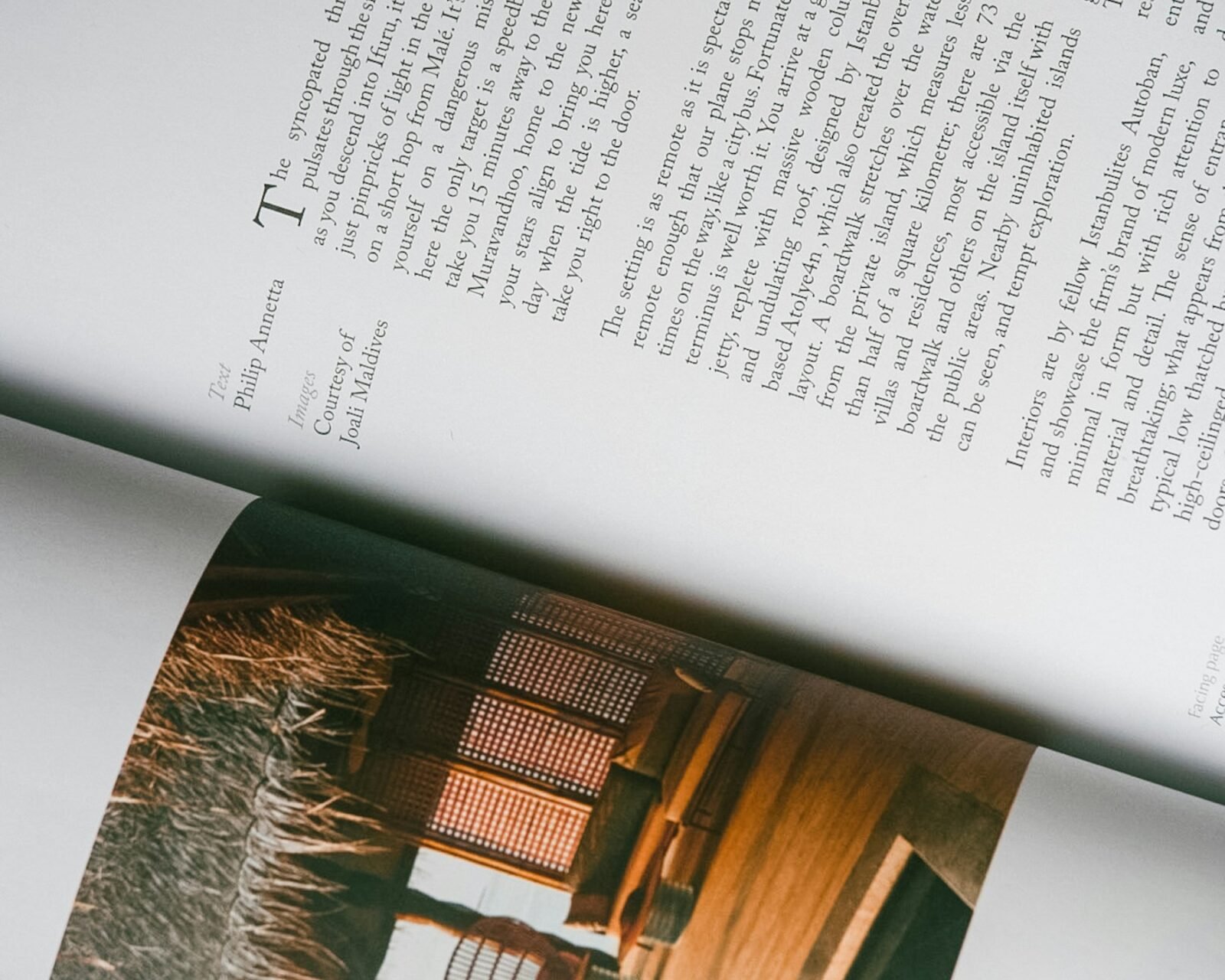
We look for three things: an x-height that holds at body sizes, contrast that survives sub-pixel rendering, and italics that were actually drawn rather than slanted.
Our shortlist
Pair it with a sans that shares its proportions, not its personality. The two should agree on the baseline and disagree about everything else.
- Newsreader for display, when the brand can carry an editorial voice.
- A transitional face for long-form reading.
- Tabular figures, always, for anything with a number in it.
A typeface is a voice. Choose one you would want to hear read the terms and conditions.
Studio note
In practice
We keep a running document of these decisions for every client, so the next designer — in-house or external — inherits reasons, not just files.